-
[WEB] Flex 레이아웃Web 2022. 7. 28. 17:00
- flex 속성 (하나의 플렉스 아이템이 자신의 컨테이너가 차지하는 공간에 맞추기 위해 크기를 키우거나 줄이는 방법을 설정하는 속성)
https://developer.mozilla.org/ko/docs/Web/CSS/flex
flex - CSS: Cascading Style Sheets | MDN
flex CSS 속성은 하나의 플렉스 아이템이 자신의 컨테이너가 차지하는 공간에 맞추기 위해 크기를 키우거나 줄이는 방법을 설정하는 속성입니다.
developer.mozilla.org
- flex-direction 기본축 설정 (플렉스 컨테이너 내의 아이템을 배치할 때 사용할 주축 및 방향(정방향, 역방향)을 지정)
<!DOCTYPE html>
<html lang="en">

<head>
    <meta charset="UTF-8">
    <meta http-equiv="X-UA-Compatible" content="IE=edge">
    <title>object-fit</title>
    <link rel="stylesheet" href="css/style.css">
</head>
<body>
    <main>
        <section>
            <article></article>
            <article></article>
            <article></article>
            <article></article>
            <article></article>
        </section>
    </main>
</body>
</html>
@charset "UTF-8"; * { margin: 0px; padding: 0px; } main{ width:100%; height:100vh; background: lightcyan; } /* flex는 레이아웃 요소를 부모요소에 설정 */ main section{ border:10px solid blue; /* 자식 넓이만큼 flex적용 */ display: inline-flex; /* 세로 방향으로 배치 */ flex-direction: column; } main section article{ width:100px; height:100px; background: aqua; border:1px solid #000; }
https://developer.mozilla.org/ko/docs/Web/CSS/flex-direction
flex-direction - CSS: Cascading Style Sheets | MDN
flex-direction CSS 속성은 플렉스 컨테이너 내의 아이템을 배치할 때 사용할 주축 및 방향(정방향, 역방향)을 지정합니다.
developer.mozilla.org
- flex-wrap (flex-item 요소들이 강제로 한줄에 배치되게 할 것인지, 또는 가능한 영역 내에서 벗어나지 않고 여러행으로 나누어 표현(강제 줄바꿈) 할 것인지 결정하는 속성)
/* flex는 레이아웃 요소를 부모요소에 설정 */
main section{
    border:10px solid blue;
    display: flex;
    /* 가로 방향으로 배치 */
    flex-direction: row;
    /* 기본설정 */
    flex-wrap:nowrap;
}
- 기본설정일때는 강제로 한줄에 배치

- 일정 크기가 되면 강제로 줄바꿈하도록 설정
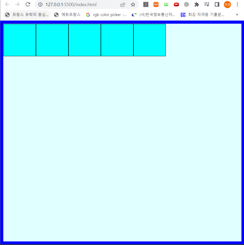
/* flex는 레이아웃 요소를 부모요소에 설정 */
main section{
    border:10px solid blue;
    display: flex;
    /* 가로 방향으로 배치 */
    flex-direction: row;
    /* 강제 줄바꿈 */
    flex-wrap:wrap;
}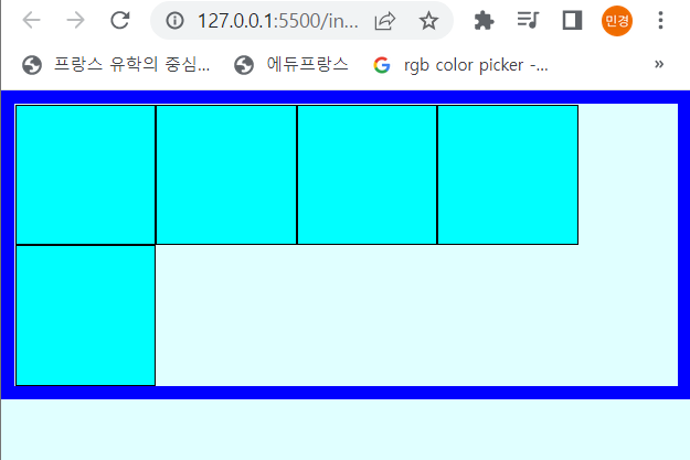
https://developer.mozilla.org/ko/docs/Web/CSS/flex-wrap
flex-wrap - CSS: Cascading Style Sheets | MDN
CSS flex-wrap property는 flex-item 요소들이 강제로 한줄에 배치되게 할 것인지, 또는 가능한 영역 내에서 벗어나지 않고 여러행으로 나누어 표현 할 것인지 결정하는 속성입니다. 만약 영역 내에서 벗
developer.mozilla.org
- flex-flow (flex-wrap과 flex-direction을 합친 속성 : 기본축과 줄바꿈 설정)
main section{
    border:10px solid blue;
    display: flex;
    flex-flow:column nowrap;
}
flex-flow : column nowrap;은 아래의 코드와 동일
flex-direction : column;
flex-wrap : nowrap;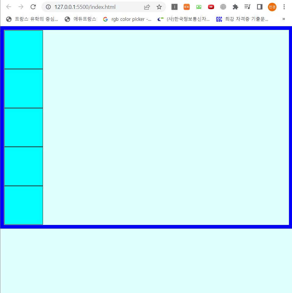
https://developer.mozilla.org/ko/docs/Web/CSS/flex-flow
flex-flow - CSS: Cascading Style Sheets | MDN
flex-flow CSS 속성은 flex-direction, flex-wrap 속성의 단축 속성입니다.
developer.mozilla.org
- justify-content (기본축 정렬-자식요소 정렬)
- flex-start (왼쪽으로 배치)
@charset "UTF-8"; * { margin: 0px; padding: 0px; } main{ width:100%; height:100vh; background: lightcyan; } /* flex는 레이아웃 요소를 부모요소에 설정 */ main section{ width:100%; height:100%; border:10px solid blue; box-sizing:border-box; display: flex; flex-flow:row wrap; justify-content: flex-start; } main section article{ width:100px; height:100px; background: aqua; border:1px solid #000; }- flex-end (오른쪽으로 배치)

main section{ width:100%; height:100%; border:10px solid blue; box-sizing:border-box; display: flex; flex-flow:row wrap; justify-content: flex-end; }- space-between (사이 공간 균등하게 배치)

main section{ width:100%; height:100%; border:10px solid blue; box-sizing:border-box; display: flex; flex-flow:row wrap; justify-content: space-between; }- space-around (양쪽 여백 균일하게 지정하고 사이 공간 균등 배치)

main section{ width:100%; height:100%; border:10px solid blue; box-sizing:border-box; display: flex; flex-flow:row wrap; justify-content: space-around; }- space-evenly (중첩까지 고려해서 양쪽 여백과 사이공간 다 균등하게 배치)

main section{
    width:100%;
    height:100%;
    border:10px solid blue;
    box-sizing:border-box;
    display: flex;
    flex-flow:row wrap;
    justify-content: space-evenly;
}
https://developer.mozilla.org/en-US/docs/Web/CSS/justify-content
justify-content - CSS: Cascading Style Sheets | MDN
The CSS justify-content property defines how the browser distributes space between and around content items along the main-axis of a flex container, and the inline axis of a grid container.
developer.mozilla.org
- align-content (기본축으로 지정된것의 반대축 정렬-자식요소 정렬)
main section{
    width:100%;
    height:100%;
    border:10px solid blue;
    box-sizing:border-box;
    display: flex;
    flex-flow:row wrap;
    /* flex-direction으로 지정된 축이 기준 */
    justify-content: center;
    /* flex-direction으로 지정된 축의 반대축 기준 */
    align-content: center;
}
단, flex-wrap이 nowrap일 경우에는 align-content가 적용되지않으므로, align-items를 이용!
main section{
    width:100%;
    height:100%;
    border:10px solid blue;
    box-sizing:border-box;
    display: flex;
    flex-flow:row nowrap;
    /* flex-direction으로 지정된 축이 기준 */
    justify-content: center;
    /* flex-direction으로 지정된 축의 반대축 기준 */
    align-content: center;
}
main section{
    width:100%;
    height:100%;
    border:10px solid blue;
    box-sizing:border-box;
    display: flex;
    flex-flow:row nowrap;
    /* flex-direction으로 지정된 축이 기준 */
    justify-content: center;
    /* flex-direction으로 지정된 축의 반대축 기준 */
    align-items:center;
}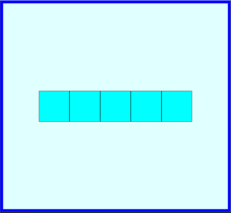
정리
flex-wrap이 wrap일 경우에는 align-content 이용 (이 경우가 조금 더 일반적인 경우!)
flex-wrap이 nowrap일 경우에는 align-items 이용- order (자식요소 순서지정)
<!DOCTYPE html>
<html lang="en">

<head>
    <meta charset="UTF-8">
    <meta http-equiv="X-UA-Compatible" content="IE=edge">
    <title>flex</title>
    <link rel="stylesheet" href="css/style.css">
</head>
<body>
    <main>
        <section>
            <article>1</article>
            <article>2</article>
            <article>3</article>
        </section>
    </main>
</body>
</html>
@charset "UTF-8"; * { margin: 0px; padding: 0px; } main{ width:100%; height:100vh; background: lightcyan; } section { width:100%; background: lightcyan; display: flex; } section article { width:100px; height:100px; background: aqua; border:1px solid #000; font-size:50px; color:#fff; display: flex; justify-content: center; /* nowrap이므로 align-items이용 */ align-items:center; } section article:nth-of-type(1) { order:2; } section article:nth-of-type(2) { order:3; } section article:nth-of-type(3) { order:1; }order 속성을 이용하여 자식 요소의 순서를 지정해주면 1, 2, 3의 순서로 적혀있음에도 불구하고 임의로 순서를 변경할수있다!

- flex-grow (안쪽여백 증가폭 설정)
<!DOCTYPE html>
<html lang="en">

<head>
    <meta charset="UTF-8">
    <meta http-equiv="X-UA-Compatible" content="IE=edge">
    <title>flex</title>
    <link rel="stylesheet" href="css/style.css">
</head>
<body>
    <main>
        <section>
            <article>FLEX GROW</article>
            <article>FLEX GROW</article>
            <article>FLEX GROW</article>
        </section>
    </main>
</body>
</html>
@charset "UTF-8"; * { margin: 0px; padding: 0px; } main{ width:100%; height:100vh; background: lightcyan; } section { width:100%; background: lightcyan; display: flex; } section article{ background: aqua; border:1px solid #000; box-sizing:border-box; font-size:50px; color:#fff; }
위와 같이 여백이 생기게되는데, 아래 코드를 추가하여 내부 여백을 수정해보면
section article:nth-of-type(1) {
    flex-grow:1;
}

section article:nth-of-type(2) {
    flex-grow:2;
}

section article:nth-of-type(3) {
    flex-grow:3;
}
지정해준 크기만큼 내부여백이 생기게된다!
https://developer.mozilla.org/ko/docs/Web/CSS/flex-grow
flex-grow - CSS: Cascading Style Sheets | MDN
flex-grow CSS property 는 flex-item 요소가, flex-container 요소 내부에서 할당 가능한 공간의 정도를 선언합니다. 만약 형제 요소로 렌더링 된 모든 flex-item 요소들이 동일한 flex-grow 값을 갖는다면, flex-c
developer.mozilla.org
- flex-shrink (안쪽여백 축소폭설정)
<!DOCTYPE html>
<html lang="en">

<head>
    <meta charset="UTF-8">
    <meta http-equiv="X-UA-Compatible" content="IE=edge">
    <title>flex</title>
    <link rel="stylesheet" href="css/style.css">
</head>
<body>
    <main>
        <section>
            <article>SHRINK</article>
            <article>SHRINK</article>
            <article>SHRINK</article>
        </section>
    </main>
</body>
</html>
flex-grow와는 반대로 작은수를 지정하면 축소되는값이 줄어들어 여백값이 커진다!
@charset "UTF-8";

* {
    margin: 0px;
    padding: 0px;
}

section {
    width:100%;
    background: pink;
    display: flex;
}

section article{
    width:400px;
    background: hotpink;
    border:1px solid #000;
    font-size:50px;
    color:#fff;
}

/* 작은수를 지정하면 오히려 축소되는 값이 줄어들어 여백값이 커짐 */
section article:nth-of-type(1) {
    flex-shrink:1;
}

section article:nth-of-type(2) {
    flex-shrink:2;
}

section article:nth-of-type(3) {
    flex-shrink:3;
}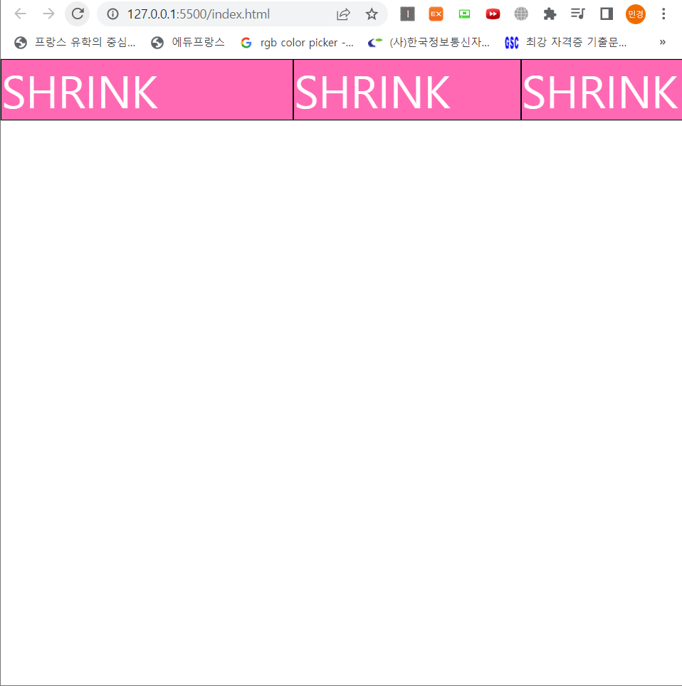
https://developer.mozilla.org/ko/docs/Web/CSS/flex-shrink
flex-shrink - CSS: Cascading Style Sheets | MDN
flex-shrink CSS property는 flex-item 요소의 flex-shrink 값을 설정하는 속성입니다. 만약 flex-item 요소의 크기가 flex-container 요소의 크기보다 클 때 flex-shrink 속성을 사용하는데, 설정된 숫자값에 따라 flex-c
developer.mozilla.org
- flex 전체 넓이값 비율 설정 (안쪽 여백의 비율을 지정하는것이 아님)
<!DOCTYPE html>
<html lang="en">

<head>
    <meta charset="UTF-8">
    <meta http-equiv="X-UA-Compatible" content="IE=edge">
    <title>flex</title>
    <link rel="stylesheet" href="css/style.css">
</head>
<body>
    <main>
        <section>
            <article>FLEX</article>
            <article>FLEX</article>
            <article>FLEX</article>
        </section>
    </main>
</body>
</html>
@charset "UTF-8"; * { margin: 0px; padding: 0px; } section { width:100%; background: lightgreen; display: flex; } section article{ background-color: green; font-size:40px; color:#fff; border : 1px solid #000; } section article:nth-of-type(1) { flex:1; } section article:nth-of-type(2) { flex:2; } section article:nth-of-type(3) { flex:3; }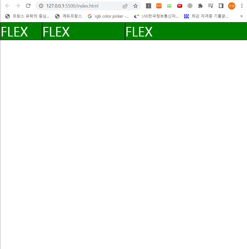
반응형 레이아웃 만들때 참고!!
[CSS] 레이아웃을 더 편하게, Flexbox
1. Flexbox를 지원하는 브라우저 Flexbox를 쓰면 훨씬(!) 더 쉽게(!!) 레이아웃을 스타일링할 수 있습니다. 기존에는 일반적으로 float 속성을 이용했는데, 이건 clearfix라는 핵이 필요했죠. 그밖에 display:
nykim.work
https://blogpack.tistory.com/862
CSS 플렉스박스(flex)로 반응형 레이아웃 만들기
플렉스박스는 이름 그대로 레이아웃을 만들 때 아주 유연하고 동적인 구조를 유지할 수 있는 박스 모델입니다. 유연한 레이아웃을 유지하는 플렉스박스의 속성을 잘 활용하면 미디어쿼리 없이
blogpack.tistory.com
'Web' 카테고리의 다른 글
[WEB] Javascript & Typescript 간단하게 정리 (0) 2022.08.06 [WEB] Javascript & Typescript 환경설치 (0) 2022.08.06 [WEB] CSS3를 활용한 웹 문서 스타일링 (0) 2022.07.19 [WEB] HTML 기본 문법 정리 (0) 2022.07.16 [WEB] 인터렉티브 UI 기획 & 디자인 (0) 2022.07.09