-
[WEB] CSS3를 활용한 웹 문서 스타일링Web 2022. 7. 19. 21:59
- 웹 문서에 stylesheet 연결
<link rel="stylesheet" href="css/style.css">
해당 코드 head태그 안에 삽입하고

css폴더에 style.css를 만들어서 css/style.css로 경로를 지정해주기.
- 선택자
- 자손 선택자 - 문서 구조에서 특정 요소의 자손을 선택하는 선택자
(자식, 손자 그 이후에 후손을 모두 포함)
- 자식 선택자 - 특정 요소의 직계 자식만 선택하는 선택자
(자식 이후 손자, 후손을 포함하지 않음)
<!DOCTYPE html>
<html lang="en">
<head>
    <meta charset="UTF-8">
    <meta http-equiv="X-UA-Compatible" content="IE=edge">
    <meta name="viewport" content="width=device-width, initial-scale=1.0">
    <title>선택자</title>
    <link rel="stylesheet" href="css/style.css">
</head>
<body>
    <div>
        <ul>
            <li>
                <a href="#">목록1</a>
            </li>
            <li>목록2</li>
        </ul>

        <a href="#">링크</a>
    </div>
</body>

</html>
@charset "UTF-8"; div{ border:1px solid red; /* 테두리 */ } div li{ /* 자손 선택자 */ border:1px solid blue; } div > a { /*자식 선택자*/ border:1px solid green; }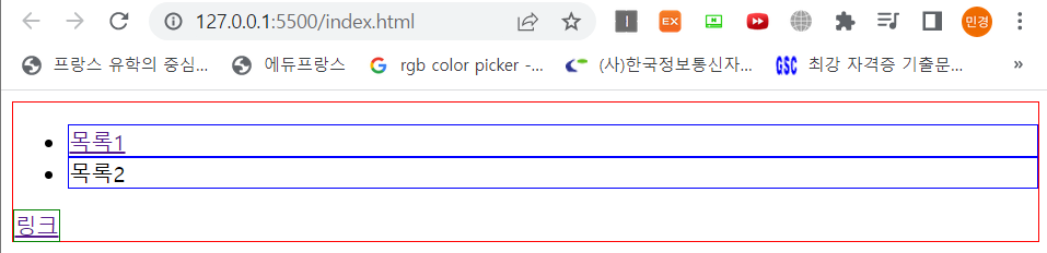
- 순서 선택자 - 순서를 이용하여 선택하는 선택자
<!DOCTYPE html>
<html lang="en">
<head>
    <meta charset="UTF-8">
    <meta http-equiv="X-UA-Compatible" content="IE=edge">
    <meta name="viewport" content="width=device-width, initial-scale=1.0">
    <title>순서 선택자</title>
    <link rel="stylesheet" href="css/style.css">
</head>
<body>
    <ul>
        <li>목록</li>
        <li>목록</li>
        <li>목록</li>
        <li>목록</li>
        <li>목록</li>
    </ul>
</body>
</html>
@charset "UTF-8"; ul li:nth-of-type(1) { /*해당 순서에 맞는 값을 출력 */ border:1px solid red; } ul li:nth-of-type(3) { /*해당 순서에 맞는 값을 출력 */ border:1px solid blue; } ul li:nth-last-of-type(1) { /*마지막 순서부터 출력 (last-chile로 해도 가능)*/ border:1px solid green; } ul li:nth-of-type(2n) { /*2의 배수 선택*/ border:1px solid purple; } ul li:nth-of-type(2n-1) { /*홀수 선택*/ border:1px solid orange; } ul li:nth-of-type(3n) { /*3의 배수 선택*/ border:1px solid black; } /*ul li:nth-of-type(odd) 홀수*/ /*ul li:nth-of-type(odd) 짝수*/
- 속성 선택자 - 특정 속성이나 특정 속성값을 가지고 있는 HTML 요소를 선택하는 선택자
<!DOCTYPE html>
<html lang="en">
<head>
    <meta charset="UTF-8">
    <meta http-equiv="X-UA-Compatible" content="IE=edge">
    <meta name="viewport" content="width=device-width, initial-scale=1.0">
    <title>속성 선택자</title>
    <link rel="stylesheet" href="css/style.css">
</head>
<body>
    아이디 <input type="text">
    비밀번호 <input type="password">
</body>
</html>
@charset "UTF-8"; input[type="text"]{ border:1px solid blue; } input[type="password"] { border :1px solid red; }
- 클래스, 아이디 선택자
id 선택자 : 동일한 이름 사용 불가능 X, 한 곳에만 적용해서 사용, css 표시 : #이름
class 선택자 : 동일한 이름 사용 가능 O, 동일한 여러 곳에 적용해서 사용, css 표시 : .이름
<!DOCTYPE html>
<html lang="en">
<head>
    <meta charset="UTF-8">
    <meta http-equiv="X-UA-Compatible" content="IE=edge">
    <meta name="viewport" content="width=device-width, initial-scale=1.0">
    <title>클래스 선택자</title>
    <link rel="stylesheet" href="css/style.css">
</head>
<body>
    <p class="blue">Lorem ipsum dolor sit amet.</p>
    <p class="red">Lorem ipsum dolor sit amet.</p>
    <p id="blueid">Lorem ipsum dolor sit amet.</p>
    <p id="redid">Lorem ipsum dolor sit amet.</p>
</body>
</html>
@charset "UTF-8"; p.blue{ /*class가 blue인 p 태그 (.blue로 써도 가능)*/ border:1px solid blue; } p.red{ /*class가 red인 p 태그 (.red로 써도 가능)*/ border:1px solid red; } p#blueid{ /*id가 blueid인 p 태그 (#blueid로 써도 가능)*/ border:1px solid blue; } p#redid { /*id가 redid인 p 태그 (#redid로 써도 가능)*/ border:1px solid red; }- 가상 선택자 - 선택자 뒤에 :가상이벤트를 붙이면 특정 이벤트마다 적용 할 스타일을 설정할 수 있는 선택자
<!DOCTYPE html>
<html lang="en">
<head>
    <meta charset="UTF-8">
    <meta http-equiv="X-UA-Compatible" content="IE=edge">
    <meta name="viewport" content="width=device-width, initial-scale=1.0">
    <title>가상 선택자</title>
    <link rel="stylesheet" href="css/style.css">
</head>
<body>
    <div>
        content
    </div>
</body>
</html>
@charset "UTF-8"; div{ border:1px solid red; } div:hover{ /*마우스 hover하면 변경*/ border:1px solid blue; } div:active { /*마우스 click하면 변경*/ border:1px solid green; } div:before{ /*div안쪽에 content 삽입*/ content: "before"; border:1px solid black; } div:after{ content:"after"; border:1px solid orange; }CSS 가상 클래스 선택자 - ofcourse
개요 선택자 뒤에 :가상이벤트를 붙이면 특정 이벤트마다 적용 할 스타일을 설정 할 수 있으며, 이를 가상 (추상)클래스라 합니다. :link - 방문한 적이 없는 링크 :visited - 방문한 적이 있는 링크 :h
ofcourse.kr

- 블록, 인라인 요소
- 블록 요소 : 특정 영역을 잡아서 블록 쌓듯이 레이아웃 설정하는 태그들
ex) h1-h6, p, ul, ol, dl, div
특징1 : 자동 줄바꿈
특징2 : 넓이값 미지정시 부모요소 넓이값을 100% 상속받음
특징3 : 넓이와 높이값 크기를 지정 가능
특징4 : 블록요소는 자식요소로 블록, 인라인 요소 모두를 감쌀수있다. - 인라인 요소 : 특정 구문에서 기능이나 디자인 효과를 줄때 쓰는 태그들
ex) a, strong, em
특징1 : 자동 불바꿈이 안되고 옆으로 붙음
특징2 : 넓이값 미지정시 인라인 요소 감싼 컨텐츠가 자신의 크기
특징3 : 넓이, 높이값 지정 불가
특징4 : 인라인 요소는 인라인 요소만 감쌀 수 있다.
<!DOCTYPE html>
<html lang="en">

<head>
    <meta charset="UTF-8">
    <meta http-equiv="X-UA-Compatible" content="IE=edge">
    <meta name="viewport" content="width=device-width, initial-scale=1.0">
    <title>블록, 인라인 요소</title>
    <link rel="stylesheet" href="css/style.css">
</head>
<body>
    <div>
        <h1>제목</h1>
        <!-- <a><h1>제목</h1></a> : 이런식으로 블록 요소를 인라인 요소로 감쌀 수 없음.-->
        <p><strong>Lorem</strong> ipsum dolor sit amet consectetur adipisicing elit. Necessitatibus, nihil facilis impedit est ipsum eligendi aliquid ipsa accusamus praesentium eaque accusantium reiciendis eum sapiente quae eius, tempora vitae expedita. Unde facilis et sed modi qui est nemo! Soluta repellendus beatae, eum ratione veniam delectus temporibus ut cumque, eos modi aliquam exercitationem quam nostrum provident fugit! Quo commodi animi deserunt harum. Illo ea nihil accusamus similique itaque, deleniti, impedit aliquam repellat mollitia soluta ut cum dolor odio in expedita necessitatibus minus vitae labore unde alias quia exercitationem natus, aperiam sequi. Rem accusantium aut magnam possimus adipisci repellat natus eveniet, officiis voluptatibus!</p>
        <ul>
            <li>목록</li>
            <li>목록</li>
        </ul>
    </div>
    <a href="#">링크</a>
</body>

</html>
@charset "UTF-8"; h1{ border:1px solid red; width:500px; } p{ border:1px solid blue; width:500px; } div{ border:10px solid black; } p strong { border:1px solid green; /*넓이, 높이값 지정 불가*/ width:200px; height: 200px; } a{ border:1px solid red; display: block; /*인라인 요소 블록화*/ /*inline-block : 모든 속성은 인라인이지만, 넓이와 높이값 변경 가능*/ }
- 서식관련 CSS
<!DOCTYPE html>
<html lang="en">

<head>
    <meta charset="UTF-8">
    <meta http-equiv="X-UA-Compatible" content="IE=edge">
    <meta name="viewport" content="width=device-width, initial-scale=1.0">
    <title>서식관련 CSS</title>
    <link rel="stylesheet" href="css/style.css">
</head>
<body>
    <h1>Title</h1>
    <p>Lorem ipsum dolor, sit amet consectetur adipisicing elit. Vitae autem odit fugit nulla facilis inventore sint sit aperiam, repellat saepe iure delectus voluptatem culpa ipsum explicabo assumenda distinctio quam voluptas libero labore et exercitationem tempore facere amet! Ducimus aspernatur expedita at maxime velit, laboriosam aliquid perferendis assumenda neque laborum aut facilis repellendus, quos sunt? Vero et consequuntur sint in dolorum?</p>
</body>

</html>
@charset "UTF-8"; p { font-weight:bold; /*글자 굵기 (기본값 : normal)*/ font-size:20px; /*글자 크기 (기본값 : 16px)*/ line-height:60px; /*줄간격 (1, 1.5,,,이런식으로 글자크기에 비례해서 실수값을 줄수도있음)*/ font-family: "arial"; /*글자 모양*/ /*font : bold 20px/60px "arial"; - 한번에 작성하기*/ color:blue; /*정렬방식 (기본값 : left)*/ text-align: justify; /*양쪽정렬*/ /*글자 자간*/ letter-spacing: 0px; } h1 { /*기본값 : bold*/ font-weight:normal; }
- 배경관련 CSS
https://ofcourse.kr/css-course/background-%EC%86%8D%EC%84%B1
CSS background 속성 - ofcourse
개요 background 속성은 태그의 배경을 지정하는 속성으로, font 속성과 비슷하게 세부적인 속성들을 한번에 쓸 수 있는 속성입니다. 아래의 세부적인 속성을 가집니다. background-color 배경색을 의미
ofcourse.kr
<!DOCTYPE html>
<html lang="en">
<head>
    <meta charset="UTF-8">
    <meta http-equiv="X-UA-Compatible" content="IE=edge">
    <meta name="viewport" content="width=device-width, initial-scale=1.0">
    <title>배경관련 CSS</title>
    <link rel="stylesheet" href="css/style.css">
</head>
<body>
    <div class="box"></div>
</body>
</html>
@charset "UTF-8"; .box{ width:1200px; height: 800px; border:1px solid black; background-color:pink; background-image:url(../img/rose.jpg); /*../ : 상위폴더로 나오기*/ background-repeat: no-repeat; /*이미지 반복 X*/ background-position: center center; /*가로축, 세로축 위치값을 적을수도있고(100px 200px), 위치를 지정할수도있음 (right bottom)*/ background-size: cover; /*화면에 꽉 채우기 (contain : 본래 이미지)*/ /*한번에 작성 background: pink url(../img/rose.jpg) no-repeat center center/cover;*/ }- 바깥여백 설정 (margin)
<!DOCTYPE html>
<html lang="en">
<head>
    <meta charset="UTF-8">
    <meta http-equiv="X-UA-Compatible" content="IE=edge">
    <meta name="viewport" content="width=device-width, initial-scale=1.0">
    <title>레이아웃 CSS</title>
    <link rel="stylesheet" href="css/style.css">
</head>
<body>
    <div class="box1">box1</div>
    <div class="box2">box2</div>
</body>
</html>
@charset "UTF-8"; .box1{ width:300px; height: 300px; background-color: pink; font-size:30px; /*margin:0 50px 200px 400px; 바깥여백(시계방향)*/ margin :100px; } /*margin 값이 세로로 겹치면 margin 중첩현상이 일어나서 하나만 적용됨*/ .box2{ width: 300px; height: 300px; background-color: lightblue; font-size:30px; margin:100px; }https://ofcourse.kr/css-course/margin-padding-%EC%86%8D%EC%84%B1
CSS margin,padding 속성 - ofcourse
개요 margin과 padding 속성은 각각 바깥쪽 여백, 안쪽 여백을 의미합니다. width, height 속성과 마찬가지로 숫자 뒤에 단위를 표시하여 적습니다. margin과 padding는 border 을 경계로 나뉩니다. 방향 방향
ofcourse.kr

- 안쪽여백 설정
@charset "UTF-8";

.box1 {
    width: 200px;
    height: 200px;
    background-color: pink;
    font-size: 30px;
    /*margin:0 50px 200px 400px; 바깥여백(시계방향)*/
    margin: 100px;
    padding: 50px;
    /*padding 값을 주면 크기가 커지므로 padding값 적용으로 인해 커진 값만큼 width, height를 줄여주어야함(300->200)*/
}

/*margin 값이 세로로 겹치면 margin 중첩현상이 일어나서 하나만 적용됨*/

.box2 {
    width: 300px;
    height: 300px;
    background-color: lightblue;
    font-size: 30px;
    margin: 100px;
}
- 테두리 설정
@charset "UTF-8";

.box1 {
    width: 160px;
    height: 160px;
    background-color: pink;
    font-size: 30px;

    margin: 100px;
    padding: 50px;

    /*상하좌우 40px 늘어났으므로 width, height 40px씩 줄여주기(200->160)*/
    border-width:20px; /*테두리 굵기*/
    border-style:dotted; /*실선(solid), 점선(dotted)*/
    border-color:red;

    /*축약형*/
    /*border:20px dashed red;*/
}

.box2 {
    width: 300px;
    height: 300px;
    background-color: lightblue;
    font-size: 30px;
    margin: 100px;

    border:20px solid blue;
    box-sizing: border-box; /*padding, border값이 기존 크기에 흡수됨*/
}
- 요소 가운데 배치
text-align : center과 margin : 0px auto; 차이
- text-align : center
블록요소 안쪽에 있는 인라인 요소를 가로 가운데 배치
- margin : 0px auto;
블록요소 자체를 가로 가운데 배치
(일반 글자도 인라인 요소!)
<!DOCTYPE html>
<html lang="en">
<head>
    <meta charset="UTF-8">
    <meta http-equiv="X-UA-Compatible" content="IE=edge">
    <meta name="viewport" content="width=device-width, initial-scale=1.0">
    <title>요소 가운데 배치</title>
    <link rel="stylesheet" href="css/style.css">
</head>
<body>
     <div>
        TEXT
     </div>
</body>
</html>
@charset "UTF-8"; div{ width:300px; height: 300px; background: orange; text-align: center; /*글자 가운데 배치*/ margin:0px auto; /*블록 가운데 배치*/ font-size:30px; }
- 자식콘텐츠 넘김 처리 (overflow 속성)
https://developer.mozilla.org/ko/docs/Web/CSS/overflow
overflow - CSS: Cascading Style Sheets | MDN
overflow CSS 단축 속성은 요소의 콘텐츠가 너무 커서 요소의 블록 서식 맥락에 맞출 수 없을 때의 처리법을 지정합니다. overflow-x (en-US), overflow-y (en-US)의 값을 설정합니다.
developer.mozilla.org
<!DOCTYPE html>
<html lang="en">
<head>
    <meta charset="UTF-8">
    <meta http-equiv="X-UA-Compatible" content="IE=edge">
    <meta name="viewport" content="width=device-width, initial-scale=1.0">
    <title>자식 콘텐츠 넘김처리</title>
    <link rel="stylesheet" href="css/style.css">
</head>
<body>
     <div>
        Lorem ipsum dolor sit amet consectetur adipisicing elit. Exercitationem consequuntur commodi molestias eligendi, beatae error. Iste nulla repellat nobis enim maxime, corporis qui suscipit architecto aliquid expedita ullam perferendis consequuntur?
     </div>
</body>
</html>
@charset "UTF-8"; div{ width:200px; height:200px; background: lightgreen; font-size:20px; overflow: auto; /*자식콘텐츠가 넘쳤을때 숨김처리(hidden), 자동스크롤바(auto), 표시처리(visible)*/ }
- 구글 웹 폰트 사용
Google Fonts
Making the web more beautiful, fast, and open through great typography
fonts.google.com
예시) link와 css 코드를 복사해서 붙여넣으면 사용할수있다!

html 파일)
<!DOCTYPE html>
<html lang="en">

<head>
    <meta charset="UTF-8">
    <meta http-equiv="X-UA-Compatible" content="IE=edge">
    <meta name="viewport" content="width=device-width, initial-scale=1.0">
    <title>구글 웹 폰트 연결</title>
    <link rel="stylesheet" href="css/style.css">
    <link rel="preconnect" href="https://fonts.googleapis.com">
    <link rel="preconnect" href="https://fonts.gstatic.com" crossorigin>
    <link href="https://fonts.googleapis.com/css2?family=Roboto:wght@100&display=swap" rel="stylesheet">
</head>

<body>
    <h1>TYPOFRAPHY</h1>
</body>

</html>
- html 파일 head부분에 복사한 link 삽입
css파일)
@charset "UTF-8";

h1{
    font-weight: normal;
    font-size:50px;
    color:black;

    font-family: 'Roboto', sans-serif;
}
- css파일 해당 태그에 복사한 css코드 삽입

해당 폰트가 적용된것을 확인할수있다!
- float 요소 활용해서 좌우 배치하기 (자세한 사항은 아래 참조)
https://poiemaweb.com/css3-float
CSS3 Float | PoiemaWeb
float 프로퍼티는 주로 레이아웃을 구성할 때 블록 레벨 요소를 가로 정렬하기 위해 사용되는 중요한 기법이다. flexbox 레이아웃를 사용한다면 더욱 간단하게 정렬을 구현할 수도 있지만 flexbox 레
poiemaweb.com
float 요소로 정렬을 할시에는 부모요소의 높이값이 자식요소에 인식이 안되는 문제점이 생길수있음.

float요소에서 부모요소가 자식 요소 높이값을 인식시키는 다양한 방법이 있지만 6번 방법(가상선택자 이용)을 가장 권장함!
<!DOCTYPE html>
<html lang="en">

<head>
    <meta charset="UTF-8">
    <meta http-equiv="X-UA-Compatible" content="IE=edge">
    <meta name="viewport" content="width=device-width, initial-scale=1.0">
    <title>float</title>
    <link rel="stylesheet" href="css/style.css">
</head>
<body>
    <div class="wrap">
        <div class="left"></div>
        <div class="right"></div>
        <!-- <div class="bottom"></div> -->
    </div>

    <!--
        float 설정시 부모요소가 자식 요소 높이값 인식시키는 방법
        1. 부모요소에 강제 높이값 지정
        2. 부모요소에 강제로 overflow : auto;로 지정
        3. 부모요소에 강제로 overflow : hidden;로 지정
        4. 부모요소에 float에 left/right 지정
        5. float된 요소의 아래쪽에 배치되는 요소에 clear:both; 적용
        6. 부모요소에 가상선택자 ::after를 이용해서 clear:both; 적용 (권장사항)
     -->
</body>
</html>
@charset "UTF-8"; *{ margin:0px; padding:0px; } ul,ol{ list-style: none; } a{ text-decoration: none; } .wrap{ width:800px; border:10px solid #000; margin : 100px auto; } /* float 좌우배치 */ .wrap .left{ width:400px; height:400px; background: aqua; float:left; } .wrap .right{ width:400px; height:400px; background: hotpink; float: right; } .wrap .bottom{ width:800px; height:100px; background: lightgreen; clear: both; } /* inline요소이므로 block화 시켜줘야함 */ .wrap::after{ content:""; display: block; clear:both; }가상선택자는 인라인 요소이므로 블록화시켜줘야함!

- 가상선택자 (::after, ::before - 새로운 컨텐츠를 추가하는 가상 요소)
https://blogpack.tistory.com/1025
CSS 가상 요소 "::before"와 "::after" 완벽 정리
가상 요소와 가상 클래스 CSS 가상 요소는 선택자로 선택한 요소의 뒤에 붙여 표기하는 미리 약속된 키워드를 말합니다. 요소의 특정한 부분에 정해진 기능을 하도록 가상 요소 키워드 별로 미리
blogpack.tistory.com
<!DOCTYPE html>
<html lang="en">

<head>
    <meta charset="UTF-8">
    <meta http-equiv="X-UA-Compatible" content="IE=edge">
    <meta name="viewport" content="width=device-width, initial-scale=1.0">
    <title>가상선택자</title>
    <link rel="stylesheet" href="css/style.css">
</head>
<body>
<div>
    content
</div>

</body>
</html>
@charset "UTF-8"; *{ margin:0px; padding:0px; font-size:30px; } ul,ol{ list-style: none; } a{ text-decoration: none; } /* 꾸며주기 효과를 만들때 가상선택자 이용 */ div::before{ content: "before"; color:blue; display: block; } div::after{ content: "after"; color:red; display: block; }본문에는 content만 있고 before, after가 없지만, 가상선택자를 이용하여 before, after가 추가된것을 볼수있다.

- position
https://developer.mozilla.org/ko/docs/Web/CSS/position
position - CSS: Cascading Style Sheets | MDN
CSS position 속성은 문서 상에 요소를 배치하는 방법을 지정합니다. top (en-US), right (en-US), bottom (en-US), left (en-US) 속성이 요소를 배치할 최종 위치를 결정합니다.
developer.mozilla.org
- relative - 다른 요소에 영향을 주지않고 자기 자신만 움직이는 것 (자신의 원래 영역은 유지하면서 위, 아래 좌표를 이용해서 배치)
<!DOCTYPE html>
<html lang="en">

<head>
    <meta charset="UTF-8">
    <meta http-equiv="X-UA-Compatible" content="IE=edge">
    <meta name="viewport" content="width=device-width, initial-scale=1.0">
    <title>position</title>
    <link rel="stylesheet" href="css/style.css">
</head>
<body>
<div>
    <div class="wrap">
        <div class="box1"></div>
        <div class="box2"></div>
    </div>
</div>

</body>
</html>
@charset "UTF-8"; *{ margin:0px; padding:0px; font-size:30px; } .wrap{ width:300px; height: 600px; border:10px solid #000; margin :100px auto; } .wrap .box1{ width:300px; height:300px; background: aqua; position :relative; /* 위로 50만큼 올리기 */ top:-50px; /* 오른쪽 기준 50만큼 이동 */ right:50px; } .wrap .box2{ width:300px; height:300px; background: hotpink; }- absolute - 자기자신이 아니라 자신의 부모요소가 기준점이 된다. (position값이있는 부모요소중 가장 가까운값으로 적용됨, 자신의 원래영역은 무시)
- absolute를 지정하면 화면에서 강제로 뜯어져나온다음에 얹어진다고 생각해주면 됨!

코드상으로볼때, wrap도 right도 position값이 지정되지않았으므로 body요소가 부모요소로 작용되어 화면 하단에 붙게되는것임.
<!DOCTYPE html>
<html lang="en">

<head>
    <meta charset="UTF-8">
    <meta http-equiv="X-UA-Compatible" content="IE=edge">
    <title>position</title>
    <link rel="stylesheet" href="css/style.css">
</head>
<body>
<div>
    <div class="wrap">
        <div class="left"></div>
        <div class="right">
            <p></p>
        </div>
        <div class="bottom"></div>
    </div>
</div>

</body>
</html>
@charset "UTF-8"; *{ margin:0px; padding:0px; } .wrap{ width:800px; border:10px solid #000; margin :100px auto; } .left{ width:400px; height:400px; background: aqua; float : left; } .right{ width:400px; height:400px; background: lightgreen; float : right; } .wrap::after{ content: ""; display: block; clear:both; } /* 부모요소안에 float된 요소가 하나라도 있다면 굳이 float배치를 하지않더라도 float속성을 지정 해주어야함 */ .bottom{ width:800px; height:100px; background: pink; /* 물리적인 부모요소가 800px이므로 옆으로가지못하고 아래로 내려가는 모양이 나옴 */ float:left; } .right p { width:100px; height: 100px; background: #333; position:absolute; bottom: 10px; right:10px; }아래처럼 right에 position속성을 주어야 박스안에 적용됨, right에 position을 absolute를 주게되면 화면에서 뜯어져나오므로 relative속성을 주어 화면변화가 없게 지정해주면
.right{
    width:400px;
    height:400px;
    background: lightgreen;
    float : right;
    position: relative;
}
위 화면처럼 right하단에 p태그가 붙게된다!
- fixed - 브라우저 기준으로 배치 (화면 UI에서 특정 위치에 고정시킬때 자주 사용)
<!DOCTYPE html>
<html lang="en">

<head>
    <meta charset="UTF-8">
    <meta http-equiv="X-UA-Compatible" content="IE=edge">
    <title>position</title>
    <link rel="stylesheet" href="css/style.css">
</head>
<body>
<div>
    <div class="wrap">
        <p></p>
    </div>
</div>

</body>
</html>
@charset "UTF-8"; *{ margin:0px; padding:0px; } .wrap{ width:500px; height: 500px; margin : 100px auto; border:1px solid #000; position :relative; } /* fixed : 브라우저 기준으로 배치 */ .wrap p { width:100px; height:100px; background: aqua; top : 100px; left:100px; position: fixed; }
- z-index로 z축 순서 정하기
위치 지정 요소와, 그 자손 또는 하위 플렉스 아이템의 Z축 순서를 지정 (더 큰 z-index 값을 가진 요소가 작은 값의 요소 위에 위치)
https://developer.mozilla.org/ko/docs/Web/CSS/z-index
z-index - CSS: Cascading Style Sheets | MDN
CSS z-index 속성은 위치 지정 요소와, 그 자손 또는 하위 플렉스 아이템의 Z축 순서를 지정합니다. 더 큰 z-index 값을 가진 요소가 작은 값의 요소 위를 덮습니다.
developer.mozilla.org

<!DOCTYPE html>
<html lang="en">

<head>
    <meta charset="UTF-8">
    <meta http-equiv="X-UA-Compatible" content="IE=edge">
    <title>z-index</title>
    <link rel="stylesheet" href="css/style.css">
</head>
<body>
<div>
    <div class="box1"></div>
    <div class="box2"></div>
</div>

</body>
</html>
@charset "UTF-8"; * { margin: 0px; padding: 0px; } /* z-index는 1~5사이로 주는게 가장 적당, 숫자가 클수록 위로 올라감 */ .box1 { width: 400px; height: 400px; background: aqua; position: absolute; top: 0px; left: 0px; z-index: 2; } .box2 { width: 400px; height: 400px; background: hotpink; position: absolute; top: 200px; left: 200px; z-index: 1; }- rem vs em (글자크기관련)
- rem (기준점을 잡고 기준점 대비 배수 적용 - 최상의 요소가 기준)
<!DOCTYPE html>
<html lang="en">

<head>
    <meta charset="UTF-8">
    <meta http-equiv="X-UA-Compatible" content="IE=edge">
    <title>rem vs em</title>
    <link rel="stylesheet" href="css/style.css">
</head>
<body>
<div>
    <h1>TITLE</h1>
    <p>Lorem ipsum dolor sit amet.</p>
    <a href="#">view</a>
</div>

</body>
</html>
@charset "UTF-8"; * { margin: 0px; padding: 0px; } a{ text-decoration: none; font-size: 0.8rem; } html{ font-size: 16px; } h1{ /* 기존 크기대비 3배 */ font-size:3rem; } p{ font-size:1rem; }
- em (부모요소가 기준 - 아래 코드에서는 div에 적용된 font 크기에 따라 달라지는것임)
@charset "UTF-8";

* {
    margin: 0px;
    padding: 0px;
}

a{
    text-decoration: none;
    font-size: 0.8rem;
}

html{
    font-size: 16px;
}

div{
    font-size: 40px;
}

div h1{
    font-size: 3em;
}

div p{
    font-size: 1em;
}

div a{
    font-size: 0.8em;
}
https://www.daleseo.com/css-em-rem/
CSS 상대 단위 - em과 rem
Engineering Blog by Dale Seo
www.daleseo.com
- vw, vh, vmin, vmax 단위 (화면 크기 관련 단위)
반응형 웹 뚝딱 만들기 (2) - vw, vh, vmin, vmax, em, rem 속성
프롤로그 지난 글에는 반응형을 위해 필요한 뷰포트 메타태그와 미디어 쿼리에 대해 다뤘었는데, 이번에는 CSS 속성을 통해 좀 더 편하고 쉽게 반응형을 만드는 방법을 알아보려고 합니다 🤟 히
nykim.work
- vw : 브라우저의 넓이값을 100등분한 단위
- vh : 브라우저의 높이값을 100등분한 단위
<!DOCTYPE html>
<html lang="en">

<head>
    <meta charset="UTF-8">
    <meta http-equiv="X-UA-Compatible" content="IE=edge">
    <title>vw, vm, vmin, vmax</title>
    <link rel="stylesheet" href="css/style.css">
</head>
<body>
<div>
    <p>TEXT</p>
</div>

</body>
</html>
@charset "UTF-8"; * { margin: 0px; padding: 0px; } div{ width:100vw; height:100vh; background: aqua; } div p { font-size:10vh; color:#333; text-align: center; }

화면 크기에 따라서 글자크기가 반응형으로 달라지는것을 볼수있음!!!
- vmax : 가로, 세로중 더 큰값에 따라 적용
- vmin : 가로, 세로중 더 작은값에 따라 적용
https://www.w3schools.com/cssref/css_units.as
CSS Units
W3Schools offers free online tutorials, references and exercises in all the major languages of the web. Covering popular subjects like HTML, CSS, JavaScript, Python, SQL, Java, and many, many more.
www.w3schools.com
- object-fit (img나 video요소와 같은 대체요소의 콘텐츠 크기를 어떤 방식으로 조절해 요소에 맞출 것인지 지정)
https://developer.mozilla.org/ko/docs/Web/CSS/object-fit
object-fit - CSS: Cascading Style Sheets | MDN
CSS object-fit 속성은 <img>나 <video> 요소와 같은 대체 요소의 콘텐츠 크기를 어떤 방식으로 조절해 요소에 맞출 것인지 지정합니다.
developer.mozilla.org
<!DOCTYPE html>
<html lang="en">

<head>
    <meta charset="UTF-8">
    <meta http-equiv="X-UA-Compatible" content="IE=edge">
    <title>object-fit</title>
    <link rel="stylesheet" href="css/style.css">
</head>
<body>
    <div>
        <img src="img/car1.jpg">
    </div>
</body>
</html>
@charset "UTF-8"; * { margin: 0px; padding: 0px; } div{ width:100vw; height: 100vh; border: 1px solid #000; } div img{ width:100%; height:100%; object-fit: cover; }

아까 배운대로 vw, vh를 이용하여 반응형으로 만들어주기! (이런게 있었다니,,,,이걸 이제알다니!!!!)
'Web' 카테고리의 다른 글
[WEB] Javascript & Typescript 환경설치 (0) 2022.08.06 [WEB] Flex 레이아웃 (0) 2022.07.28 [WEB] HTML 기본 문법 정리 (0) 2022.07.16 [WEB] 인터렉티브 UI 기획 & 디자인 (0) 2022.07.09 [WEB] Flask 실행하기 (AWS 서버 이용) (0) 2022.03.11